Why Business People shouldn’t do data science
Intro
Business leaders often say things like “we are a data driven company” or “we take decisions based on data”. This is a good mantra in principle. But “being data driven” is about more than adding it to a list of company values. Data needs to be done right.
Let’s go through the typical scenario of “data-driven decision making.” There is a meeting room with a big display TV at the front. Someone pulls up a chart showing a key business metric before and after a project was launched; revenue before and after a big ad campaign, for example. The person presenting the chart points out how the metric improved what looks like a healthy amount between “before” and “after.” So those in the room feel confident that they can declare the project a success that should definitely be scaled up. The meeting is wrapped up, everyone happy to have made a data-driven decision.
But even though there isn’t a shred of ill-intent in this room, the decision made can be — and often is — absolutely wrong.
Most of us have heard the phrase “correlation does not imply causation”. There’s a whole book dedicated to finding spurious correlations to pull out at parties — for example, did you know that the number of people who drowned by falling into a pool in the US correlates very highly with the number of films Nicolas Cage appeared in per year? But although it is obvious that Nicolas Cage has nothing to do with pool deaths (we hope), plenty of other causal statements sound plausible enough to pass the initial sniff test. Sometimes this causes bad decisions at home — for example, deciding not to vaccinate yourself or your family members based on a faulty correlation between vaccination rates and autism. And sometimes this causes bad decisions in meeting rooms.
Misusing data often leads to wrong decisions — worse, it leads to wrong decisions that we are confident were right decisions. So how can we figure out whether we are taking a truly data-driven decision, or whether we are simply using data to inadvertently lie to ourselves? I’ve fallen into this pitfall before, so I’d like to share some insights.
I’ll start with a bit more background, then go into a few ways we can disentangle “good” analyses from faulty or misleading ones.

What is a time-series
We probably all see time-series charts quite often at work; it’s simply a chart that plots how some metric changes over time.
In the chart that every project owner dreams of, marking the date of the project launch will show the KPI improving immediately afterwards. Let’s go back to the meeting room with the big display TV. Say that the project owner had just put a nifty chatbot called Solvemate on their website and wanted to show how they’d seen customer service requests slow down afterwards. The chart that this project owner might have shown the room would look something like this:
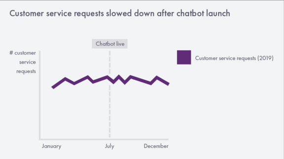
Looks perfectly valid — we were trending up before the launch, and now we are trending slightly down — so why have I been saying this kind of chart might lead to the wrong decision?
Statistical significance
Good data analysis is, unfortunately, rarely as simple as eyeballing a chart or measuring “before and after”. There are established methods that help us measure the impact our decisions have on business metrics. Unfortunately, these methods tend to be abandoned at the boardroom’s doorstep.
Here are just some of the methods that improve an analysis:
(1) Measure the before & after correctly
Cleaning data
We’ve all been in situations where we’ve wanted to pull user data and suddenly found that 30% of our traffic was unhelpfully attributed towards a user named “Guest”. But cleaning data, even though it seems like a mundane task, can actually be the most dangerous part of dealing with data. It is very, very easy to introduce bias by picking and choosing which data to accept into your analysis. Be as conservative as possible in this step. You might be forced to drop records that are missing crucial data (e.g., if you are measuring revenue based on the geography of your customers, you would by definition exclude records with a missing address). Values that you know are impossible would also have to go (for example, a 100kg serving of food in your data set is more likely to come from someone mixing up their units than a giant taking your survey). But any topics that require a judgement call in statistics should be referred to a data scientist (see the top comment on this thread for more information on the danger of chopping outliers).

Making sure that we have enough data
Some amount of data is needed to establish the “true” value of a metric, whether you are comparing revenue before and after an advertising campaign or comparing the retention rate of different customer cohorts. How much data is “enough”? This depends on exactly what you are measuring, but as a general rule, more is better. Don’t use 14 days of data if you could use 6 months instead. This handy tool will estimate the minimum sample size you need in each data set (e.g., the commonly used cohorts “before” and “after”) depending on how small of a difference you want to be able to detect (you will need a lot more data to accurately detect a 1% change in a KPI versus a 50% change in a KPI, for example).
Remove (or at least mention) as many external effects as possible
The “we did that” effect is what I call the temptation to attribute changes in a metric to the event or project you are monitoring (e.g., the launching of an ad campaign or a chatbot). In reality, there will always be external effects impacting the metric. By “external effects”, we mean anything that could affect your metric other than the original thing you wanted to measure the impact of. Examples could include seasonality, revenue growth, population growth, or competitor movements, just to name a few. It is very hard to control for different effects without a data scientist. Even with the help of a data scientist, some effects are simply impossible to “smooth out”.
To avoid a bias towards “we did that”, the minimum you should do is prepare a list of possible alternative explanations on why the KPI would be moving. For example, maybe you launched the chatbot at the end of summer, and you are the GM of a swimwear company. So you would have expected the volume of service requests to taper off, regardless of the chatbot launch. This list can then form a helpful basis for discussion, giving your audience fair caveats that will stop them from being overconfident in their conclusion. The list will also be a big help to your data scientists, if they do get involved in the analysis.
(2) Be aware of the confidence interval
In any case where you are comparing two (or more) different sets of data, you will need a “confidence interval”. Even if you’ve taken all the steps to remove outliers, account for seasonality, and collect lots of data, the real world is random and things happen due to chance all the time. Ever flipped 2 heads in a row? Even though you know that you “should” have flipped one head and one tail, because of random luck, you flipped 100% heads. This doesn’t imply that you have a fake coin; it just shows statistics in action.
Similarly, your after dataset might look like it has improved, but it could actually be showing an effect due to statistical chance. After all, there are only 2 outcomes when we compare a “before & after” data set: either a metric went up, or it went down (even if it only changed by 0.00001%).
There are a few cases that will make you less confident that a change didn’t happen because of random luck. On the one hand, you could have a “spiky” metric which fluctuates a lot (a.k.a. has high variance). On the other hand, you could have an artificially smoothed-out metric which disguises the “real” data hidden within (e.g., a revenue per week metric might be averaging out important movements in your daily revenue). On top of that, small sample sizes and small differences between your cohorts will also impact your confidence. All of these factors will make for a much wider confidence interval. I think about the confidence interval like a “threshold”; if I want to be confident that some effect “is there”, then the metric needs to change enough that it breaks this threshold.

You can use this tool to find the upper and lower bounds of your confidence interval. After you input your metric’s mean, standard deviation, sample size, and target confidence level, you will get a confidence interval as an output. This interval describes the “normal” fluctuation of your metric; anything outside this bound is defined as a “significant” difference. You can then add these thresholds to your time-series chart.

In the above example, it turns out that the after is within the confidence interval. But we can also look at the opposite case:

If the after is outside of the confidence interval, we know it is a so-called “statistically significant” change. But statistical significance tells us nothing about what caused the metric to change.
(3) Plot your counterfactuals
A counterfactual is basically a line on a chart that illustrates a hypothetical scenario: “what if we hadn’t made the change?” A good counterfactual can go miles towards helping you understand the impact of your actions.
What could be a good counterfactual in a business time-series analysis? Look no further than your last year’s data. One of the most common external effects is seasonality. So, by adding one more line to your chart showing your trend last year, you can get a feeling for whether the trend is something naturally recurring or whether it might be driven by the project you are monitoring.
So, let’s put it all together. We’ve come up with our confidence interval. We’ve come up with a list of external effects and put them on the chart to caveat our conclusions. And we’ve dug out last year’s data to start checking for seasonality. We can put all of this on the chart below; gives quite a different message, doesn’t it?

A chart like this should foster a true discussion about root-cause relationships and thus avoid some of the most common pitfalls.
Where data science comes in
I have only scratched the surface here of what is needed to be truly sure about a root-cause-relationship. If you want to go beyond business brainstorming over a time-series chart, you should go to a data scientist of your trust and ask them for help.
A good data scientist will identify which methods are appropriate or needed in order to go through the steps above. They will use their experience and acumen to clean data, ensure sufficient sample size, come up with a meaningful confidence interval, and even account for external variables (e.g., they might gather data for sales by seasons, shop conversion rate by geography, delivery speed over time, and anything else in your list of external factors. They will then produce something like a correlation between all of these and the main KPI and estimate how much of the main KPI’s change is due to variables other than the thing you wanted to measure). They will also help identify and avoid spurious correlations. In a truly data-driven company, they will also tell you very candidly if they cannot glean a definitive answer from the data — and needless to say, you should listen to them when they say this, even if it isn’t what you hoped to hear. The most warranted skepticism in data science comes when someone says that your hypothesis was correct.

Summary
As the saying goes, “there are three kinds of lies: lies, damned lies, and statistics.”
The same data set can tell many different stories depending on how you clean, cut, and visualize it. Making decisions around which methods to use is not easy — that’s why statistics and data science are thriving disciplines filled with colourful debate. But we can all do our part. Whenever you are in that meeting room looking at that time-series chart, remember to think about the following:
how was the data cleaned
has a confidence interval been calculated or does the conclusion rely on “eyeballing” a difference
have other external factors (e.g., seasonality) been controlled for or at least considered
especially if the decision is a particularly tough or important one, has a specialist been brought in to validate the analysis
Follow these best-practices to avoid common pitfalls in data analysis, but leave data science to the experts.
In closing, analyzing data is like chopping a tree in a forest. A small tree with no houses around can probably be chopped down on your own with an axe, if you are feeling brave. But if you want to take down a 100 year-old oak right next to a house… well, you should probably call in a forester before someone gets hurt. Or worse — misled.

from Cassie Kozyrkov in the style of XKCD
Resources
Learn an overview of statistics with Udacity
Calculate basic descriptive statistics (e.g., average, standard deviation) in Excel or Google Sheets
Calculate a confidence interval given a certain sample size & descriptive statistics
Calculate the minimum sample size given a certain confidence interval & minimum detectable effect